A Brief Review of A City Runs Through Them by Fergal Tobin
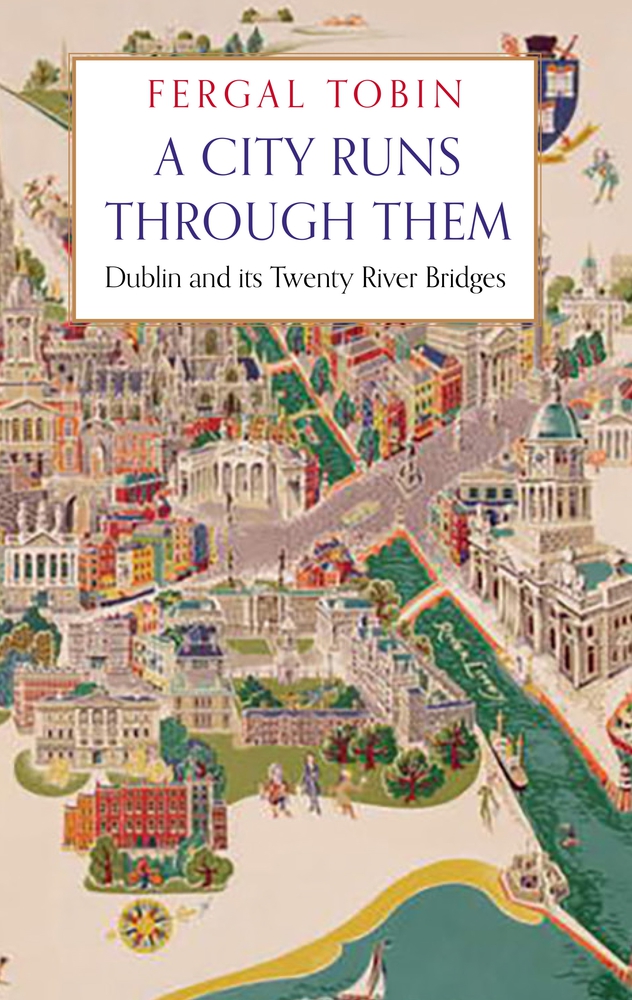
The late Fergal Tobin’s A City Runs Through Them ambitiously explores the urban evolution of central Dublin through its bridges. Tobin adopts a conceptually intriguing approach, weaving the chronological development of Dublin with the construction and significance of its bridges.…