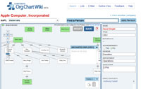
 My attention was drawn to a new Fortune Magazine initiative called the Corporate Org Chart Wiki. It bills itself as in early beta and clearly experimental. It claims to seek to ‘tap the collective knowledge’ of the community and to collect and share enterprise organizational charts. Its collaborativity certainly marks it as a wiki. Unfortunately it seems overly open to the abuse that has been associated with many of the public wikis existent today. There’s no authentication, nor any sort of transparent versioning that I can find. Its a nice little flash app and it functions efficiently. It allows a user to draw relationships and add nodes visually and relatively intuitively. It allows an observer to gain a quick appreciation of the organizational structure.
However, I wonder what the objective of this exercise is? If it is to do what it claims to be attempting, i.e. provide a publicly accessible repository of org charts for publicly traded companies, I wonder if there are not better means. I am reminded of LinkedIN, which attempts to basically accomplish a similar thing, although in a less visual manner. LinkedIN however, ensures a substantial data integrity through some form of authentication that you are who you say you are. It also leverages the fact that everyone is part of some web of interaction, whether business, personal, academic or otherwise. While I applaud fortune for the graphical approach to visualization of the org chart data that they provide, the low level of authentication seems to be a huge issue. The apparent failure of the experiment seems to be all to evident for all to see. I note on cursory examination that someone has made themselves CEO of Apple. I wonder if they can trace that self-promotion?
I wonder what the actual object of this experiment is? Maybe its about something less transparent that what it appears to be? It is an interesting foray into visual social network analysis, but I wonder whether it would really be rather more effective to screen scrape corporate sites to create such charts and perhaps allow modification as a means of verification. Interestingly, the visuals and the principle itself remind me of GENI which allows for interactive genealogy and which I blogged on earlier this year.
So I am left wondering why Fortune magazine has gotten into digital interactivity research. Don’t misunderstand me, its rather cool that they have. But I question what the research question is here. If it was merely to start to build a repository of corporate org charts, which are super fluid by nature, there is definitely more effective means to accomplish this and to ensure that these actually have some factual truth.